As we’ve all heard by now, Google’s new ranking algorithm has already forced everyone’s hand to move to Responsive Design. While addressing search rankings, you’ll also want to ensure a truly mobile-friendly experience that supports transactions, registrations, and advertising. If you are weighing Responsive Design vs. mobile templates, there are many reasons – low cost, low maintenance, simplicity – to future-proof your design and content strategy with a responsive approach.
Once you’ve decided to move forward with your responsive redesign, take the opportunity to reveiw your content strategy; is your navigation intuitive, can readers find relevant, related content, are you supporting multiple revenue channels efficiently?
Ready to get started? Here’s how the process works:
- Wireframe for desktop, tablet, and smartphone to visualize content strategy and layout
- Home Page design mockup to preview desktop, tablet, and smartphone experience
- Responsive implementation for all pages and processes, including registration and shopping cart check out
- Modifications to advertising to switch out or resize ads across the 3 views (you don’t want a 728×90 ad displaying on an iphone!)
- New UI (user interface) standards best practices: presenting the design elements and site behavior that mobile readers now expect
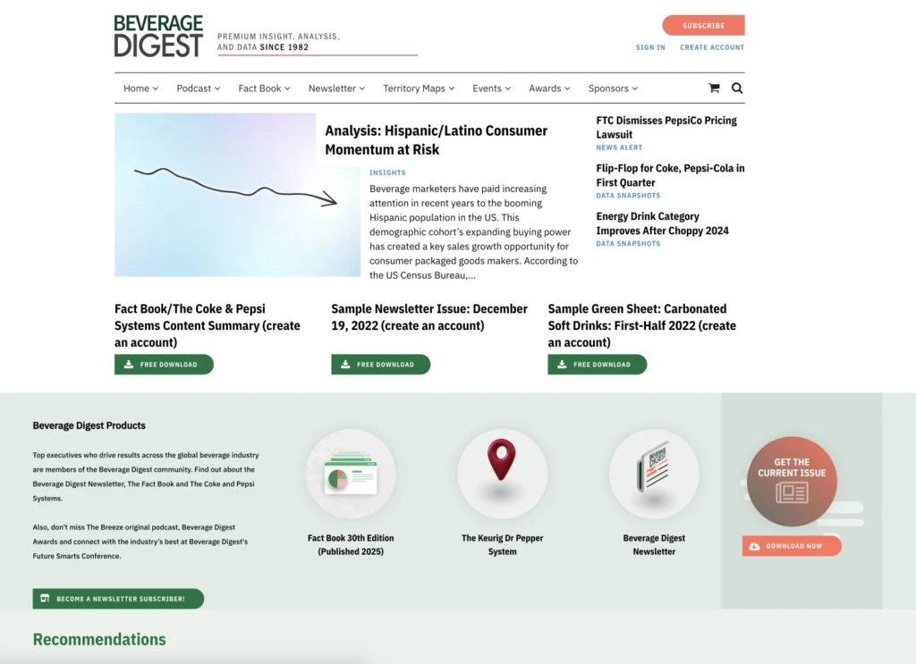
Let’s take a look at a few examples by clicking any of the thumbnails below. View them on all 3 platforms or you can simply resize your browser and watch as the layout and content elements “respond” as you reach certain widths.


Key Highlights of Responsive Design:
- Ads resize and switch out
- Content disappears or changes layout and form
- Menus are completely different on desktop vs mobile
- New UI standards such as the “hamburger menu” and using “headroom” to make the masthead completely disappear on scroll
- Many nuances that make mobile content easy read and manage!
Maybe Mobilegeddon is giving you the nudge you need to move to a mobile-friendly website design, but you won’t want to miss the opportunity to improve audience engagement, reader experience, and business performance while you’re at it.
If you’re like most publishers, it’s a safe bet that at least 25% of your traffic originates from a mobile device. Mobile readers expect an intuitive experience that supports the functionality they find when they visit your website or view email on a desktop browser. Responsive is a low maintenance approach that supports commerce, circulation, and advertising, while delivering your content in a flexible, easy-to-navigate format.

